What is a “bad error message?” Simply put, a bad error message is a dialog box or error that doesn’t make sense to anyone but the person who programmed it in the first place. We’ve all seen them, usually in very frustrating moments when our computer or website is not working properly.
According to Jakob Nielsen good error messages should:
- Clearly indicate that something has gone wrong
- Be in a human-readable language
- Be polite and not blame the users
- Describe the problem
- Give constructive advice on how to fix the problem
- Be visible and highly noticeable, both in terms of the message and how it indicates where things went wrong
- Preserve as much of the user’s work as possible so that they don’t have to do everything over again
- If possible, guess the correct action and let users pick it form a list of fixes
- Educate users by providing links to pages with an explanation of the problem
The following are examples of bad error messages to look and laugh at. The more ridiculous they seem to us, the less likely we will be us actually use them!
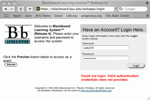
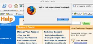
“Valid authentication credentials were not provided”
Hmm… I wonder if that means my password is wrong?
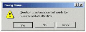
Um… is this a question?
(this one was actually on an instructional design site trying to sell programming software)
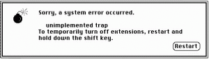
As good as Apple is about user interfaces, I’ve always wanted to ask someone on the original Mac OS team why they chose a picture of a bomb to put on their error message. Not the most friendly thing to see, especially after having just lost 2 hours of work because you hadn’t been saving every 5 minutes!
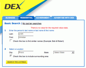
What is a “value state” I wonder? Maybe it’s near Kansas.
That’s nice… can you show me the page now please?
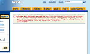
Oh, I see – Amtrak thinks I care enough about their bad programming to not use the “back” button on my browser
Do you have a good (bad) error message? Send it to us by e-mailing info[at]wideopendoors.net
Want to see more bad examples? The Isys Information Architects have a bunch of great windows dialog boxes and unintelligible error messages on their site.
[add this example IE Only? Really Blockbuster? http://twitpic.com/1vygdh ]
Usability Police
http://www.buigallery.com/